Make paperguide mobile browser firendly

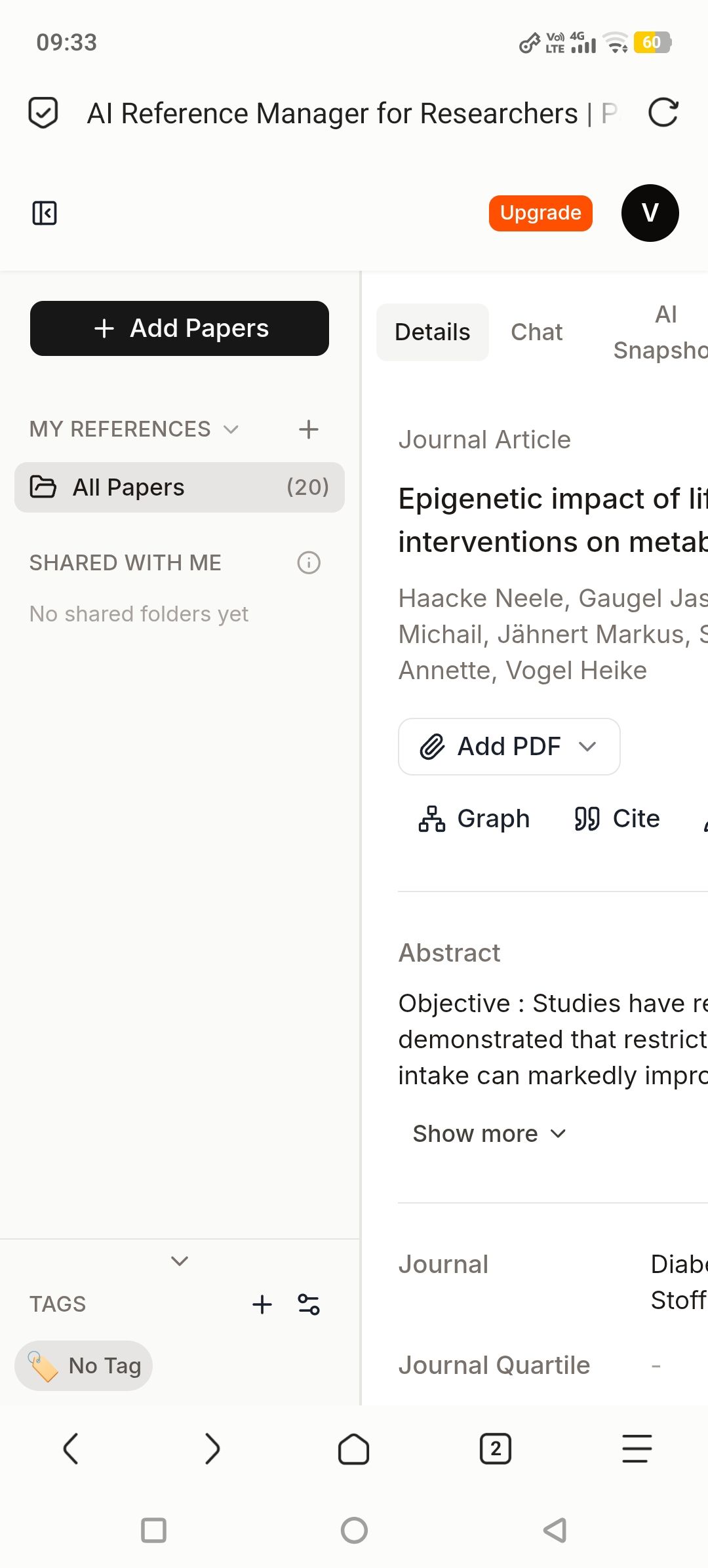
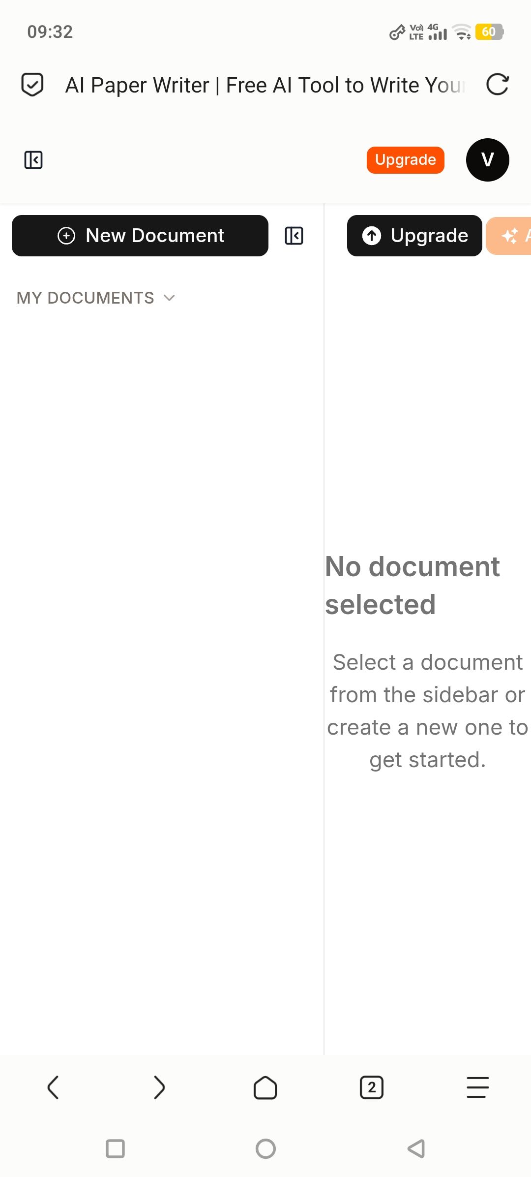
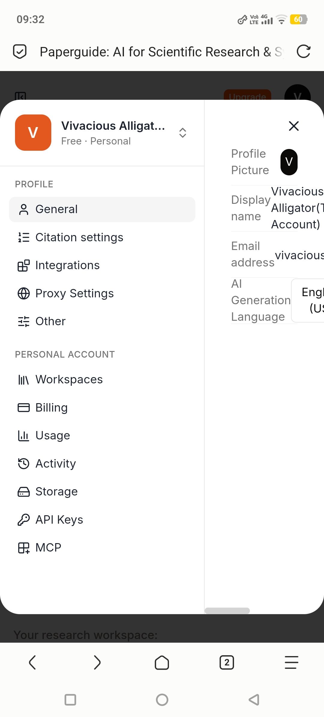
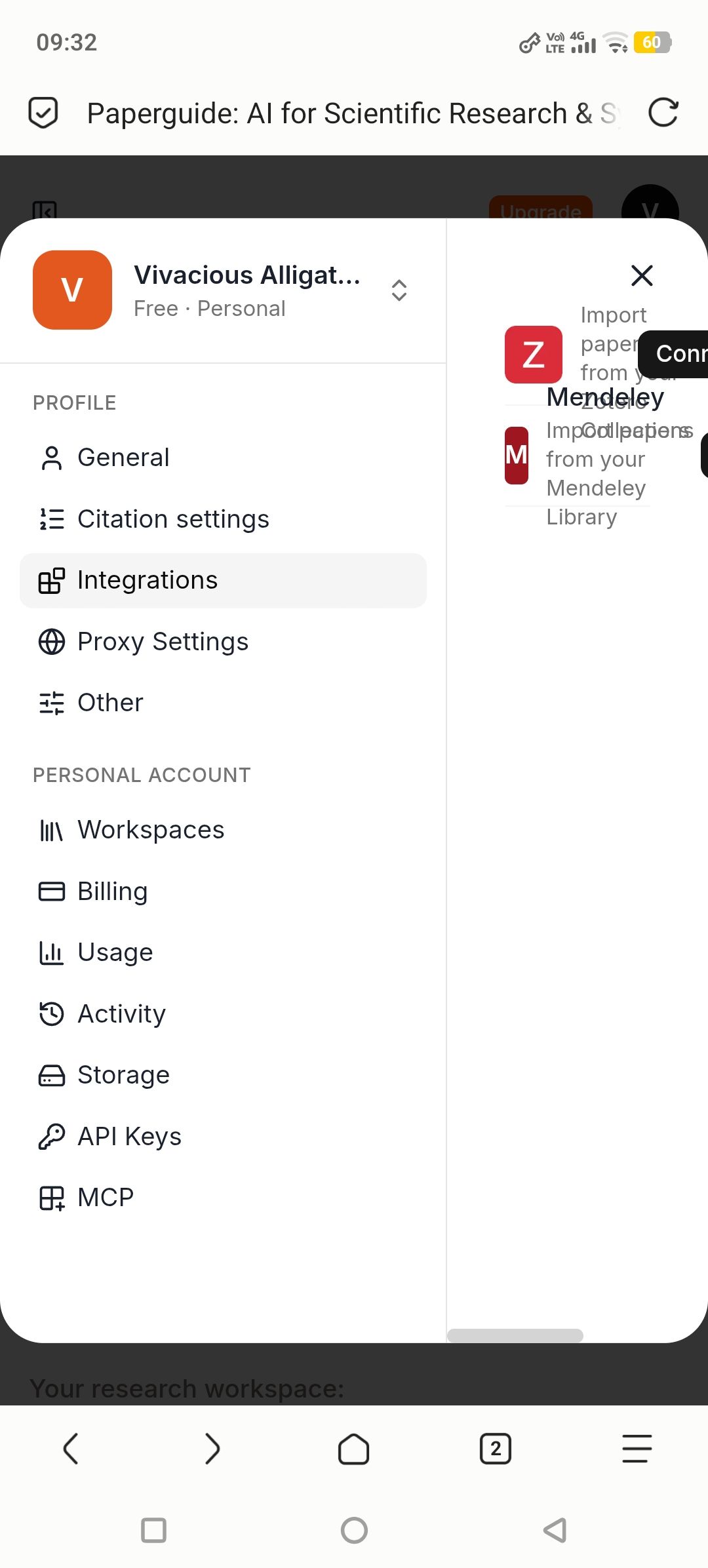
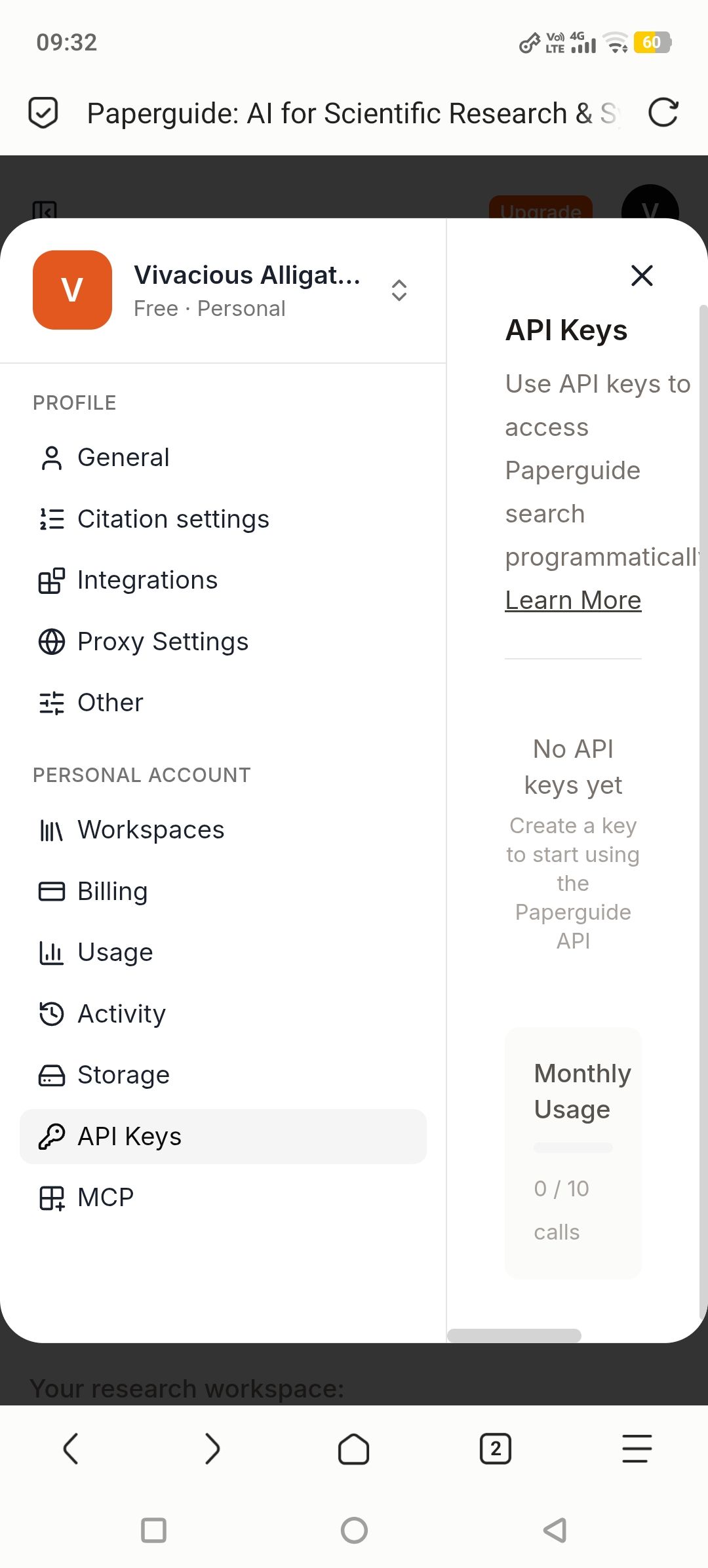
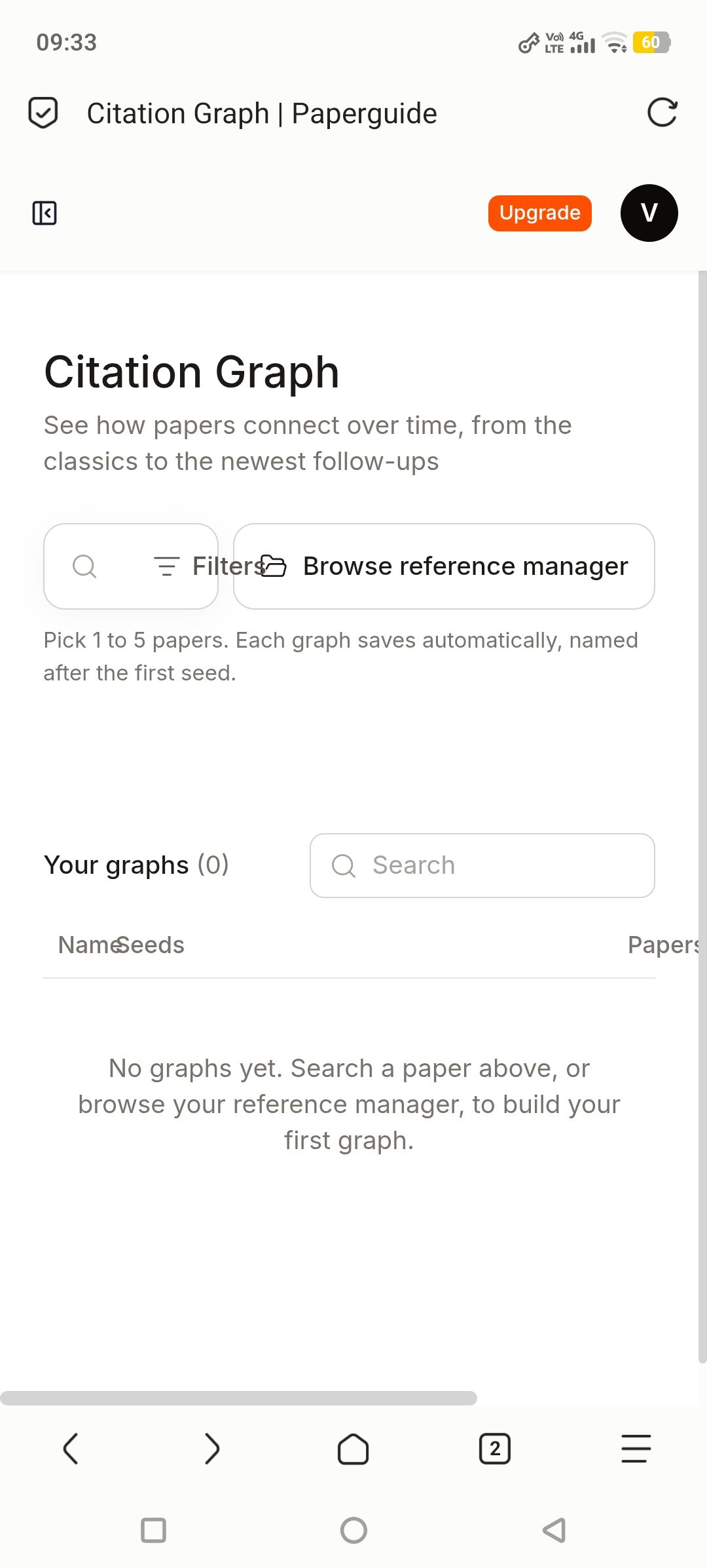
I found 2 related bugs on mobile. Screenshots attached.
Device: Android phone, Via Browser (WebView / Chromium based)
Tested also on Chrome mobile, same bug reproduces on both browsers
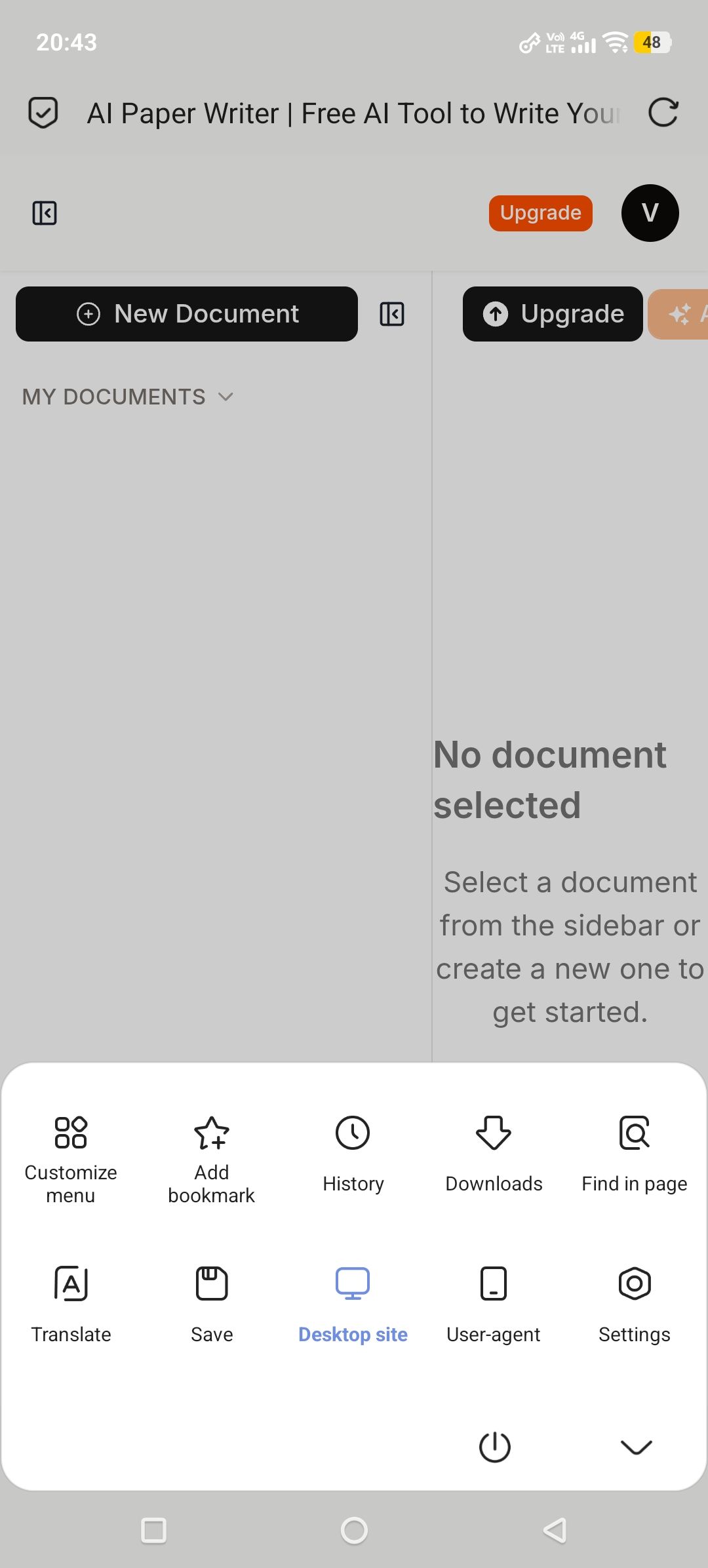
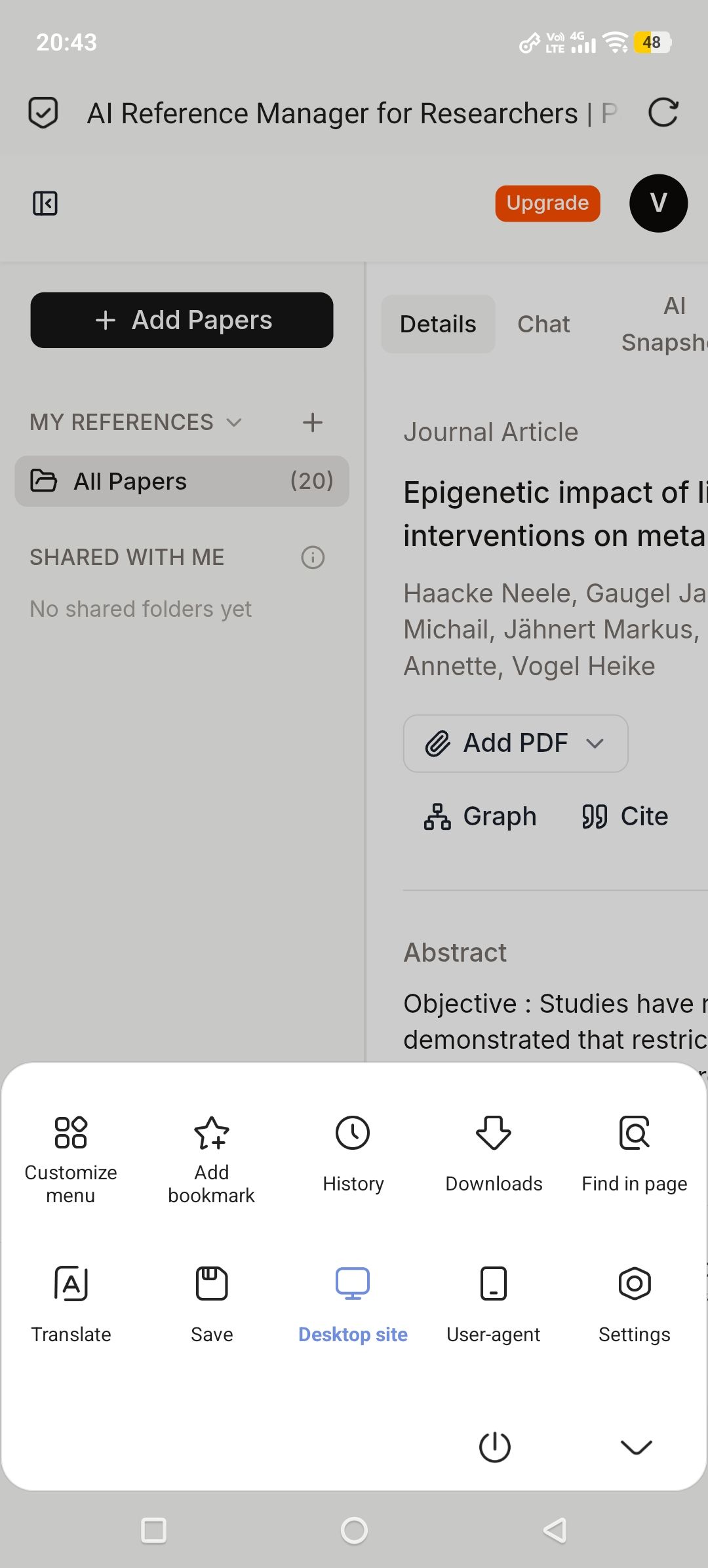
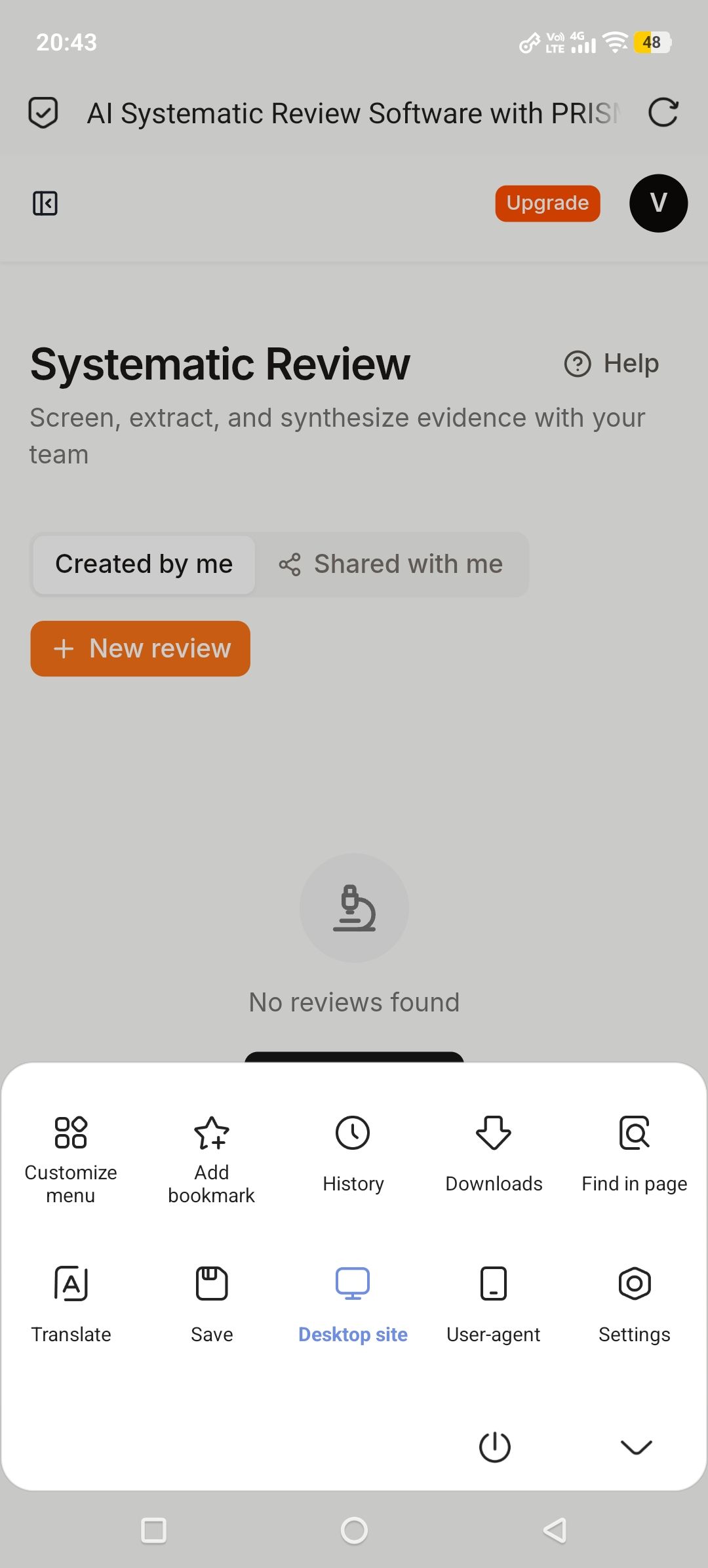
Chrome menu: Desktop site toggled ON (blue/active in screenshots)
Bug 1 - Mobile layout not responsive:
On mobile, desktop two-pane layout is forced side-by-side instead of stacking.
Reference Manager: Left sidebar (MY REFERENCES, All Papers 20) + right paper list are 50:50. Titles like "Regression from predia..." and "Epigenetic impact of li..." are truncated. Top-right "Upgrade" button is cut off.
AI Paper Writer: Left "MY DOCUMENTS" + "New Document" and right "No document selected" are side-by-side. Text is truncated.
Citation Graph: Search, "Filters", and "Browse reference manager" buttons overlap. Table headers "Name / Seeds / Papers" overlap.
Bug 2 - Desktop site mode is ignored:
When I enable "Desktop site" in Chrome mobile menu (blue/active), Paperguide does NOT respond and stays in mobile view.
Steps to reproduce Bug 2:
Open Paperguide on Chrome Android in portrait mode
Tap 3-dot menu > Enable "Desktop site" (turns blue)
Page reloads, but layout does NOT change to desktop layout
Still shows same truncated 50:50 mobile two-pane, same cut-off buttons, same truncated titles
No horizontal scroll to full desktop width, no sidebar collapse
Expected behavior for Bug 2:
When Desktop site is ON, page should render desktop layout with full width, or at least allow pinch-zoom / horizontal scroll to see full content.
Or, if Paperguide intentionally forces mobile layout, Desktop site toggle should at least widen the content area so titles and buttons are not cut off.
Actual behavior for Bug 2:
Layout stays exactly the same as mobile mode, even though Desktop site is ON.
Screenshots prove Desktop site is active (blue), but Reference Manager, AI Paper Writer, and Systematic Review still show truncated mobile view.
User has no workaround: neither mobile view nor desktop view gives a usable full-width view on phone.
Why this matters:
On phone, I cannot read full paper titles, cannot read full abstracts, and cannot tap cut-off buttons like "Upgrade" or "AI Snapshot". Desktop site was my workaround, but it does not work.
Log in to comment and vote
No comments yet
Be the first to share your thoughts.